Get in touch

Interested in working together or want to discuss a project? Send me a message.
Thank you! Your submission has been received!
Oops! Something went wrong while submitting the form.
Interested in working together or want to discuss a project? Send me a message.
Making digital an integral part of how Llumarlite communicated its services and supported customer engagement by replacing a confusing, hard-to-maintain brochure website with a connected, evidence-led platform.
Llumarlite was a UK-based lighting and engineering consultancy providing commercial lighting design, installation, bespoke manufacturing and energy-monitoring services to commercial and public-sector clients.
The website had evolved incrementally through changing priorities and multiple contributors. Its underlying structure, poor usability and weak mobile design made it frustrating to use and constrained both the development of the company’s messaging and the experience for users.
Responsibility for the website initially sat elsewhere, so changes happened on an ad hoc basis rather than through a formal brief. The site went through several iterations, including an externally supported redesign, before I had the opportunity to reconsider it more fundamentally.
The challenge was to build the case for moving beyond ad hoc, reactive changes and align stakeholders around a more fundamental redesign: creating a more adaptable digital platform that helped prospective customers understand the company, enabled existing clients to access technical content, and could evolve with the changing needs of internal teams.
Views increased by 39% in the first six months of 2022 than across the whole of 2021.
New inbound project enquiries.
CRM and analytics connected to workflows.
Reduced reliance on external development.
Moving from reactive fixes to fundamental change
Building stakeholder confidence in a more substantial redesign after years of incremental, ad hoc updates.
Different audiences, one coherent structure
Helping prospective customers understand the offer while allowing established clients to reach more detailed technical content.
Flexibility without fragmentation
Giving internal teams greater control over content and updates without recreating the inconsistency of the previous site.
Opinion versus evidence
Balancing established internal views and competing priorities with observed behaviour, analytics and stakeholder-informed audience needs.
I led the audience and stakeholder discovery, information architecture, UX and content design, prototyping, modular design-system development, Webflow implementation and analytics-led iteration. This included writing most of the website content and editing technical material contributed by colleagues.
The redesign was developed collaboratively with the Managing Director, technical sales, business development and operations, translating differing priorities into shared decisions throughout the project.
Research, insight and stakeholder alignment
Information architecture and UX design
Modular content and design-system development
Analytics, CRM and marketing-workflow integration
Prototyping, implementation and evidence-led optimisation
The existing website was organised primarily around Llumarlite’s history, achievements and past projects. Although these demonstrated the company’s experience, they did not give prospective customers a clear route into the services most relevant to their needs.
My own experience of using and maintaining the site exposed several practical usability problems. Important homepage messages relied on a slow-moving carousel and could easily be missed as people began scrolling. On mobile, cropped imagery and weak content hierarchy made pages harder to understand. News and project content required unnecessary interactions, while text placed over imagery created inconsistent readability and accessibility.
Improving the site required a clearer understanding of how people were actually using it, but without reliable behavioural evidence, digital decisions had largely been shaped by internal opinion and anecdotal feedback. I introduced analytics and behavioural measurement to understand how people entered, moved through and left the site, where journeys appeared to weaken and which content attracted limited engagement.
Alongside this quantitative evidence, I facilitated workshops and discussions with technical sales, business development and operations. Stakeholder-informed proto-personas helped make assumptions explicit and turn scattered observations into a clearer shared view of:
Organisational goals and priorities;
Prospective audiences and their reasons for visiting;
Content and communication gaps;
Technical and operational constraints.
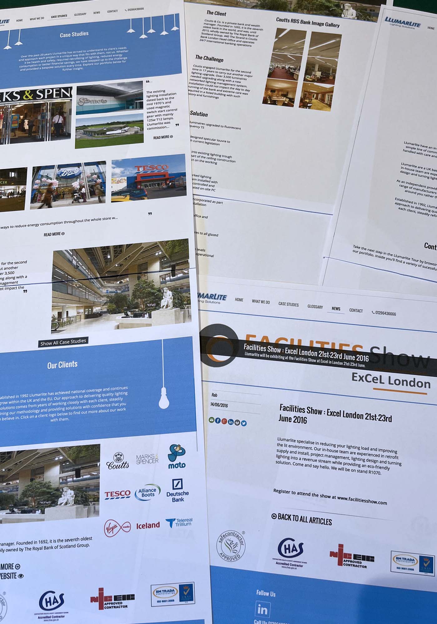
The inherited homepage relied on a rotating carousel and offered little immediate explanation of Llumarlite’s services. Important messages could disappear as slides changed, while the mobile layout cropped imagery and weakened the content hierarchy. This made it harder for visitors to establish quickly whether the company was relevant to them.
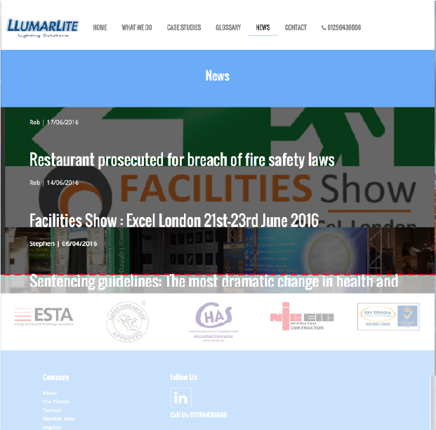

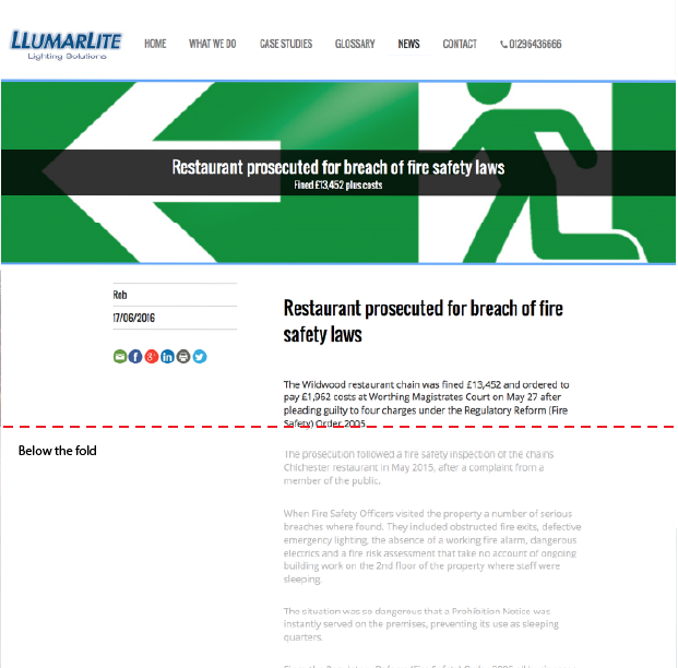
The news page is a prime example of poor usability.
Clicking the article triggered a dropdown summary of the news article, which required another click to reach the main article page. The dropdown pushed the “click to read more” button below the fold requiring the user to scroll down.
The amount of white text placed over images created an accessibility issue for users, especially on mobile devices.
| Professional role | Likely reason for visiting | What they needed first | Design consequence |
|---|---|---|---|
| Architect or specifier | Understand whether Llumarlite could support a project | Clear capabilities, relevant projects and technical credibility | Lead with service context before detailed product information |
| Building or facilities manager | Resolve an operational, compliance or maintenance concern | Practical guidance, risks and routes to specialist support | Make technical resources and contact routes easier to find |
| Engineer or contractor | Check technical suitability or obtain detailed information | Specifications, standards, compatibility and delivery support | Provide progressive access to greater technical depth |
Proto-personas developed during stakeholder workshops and discussions.
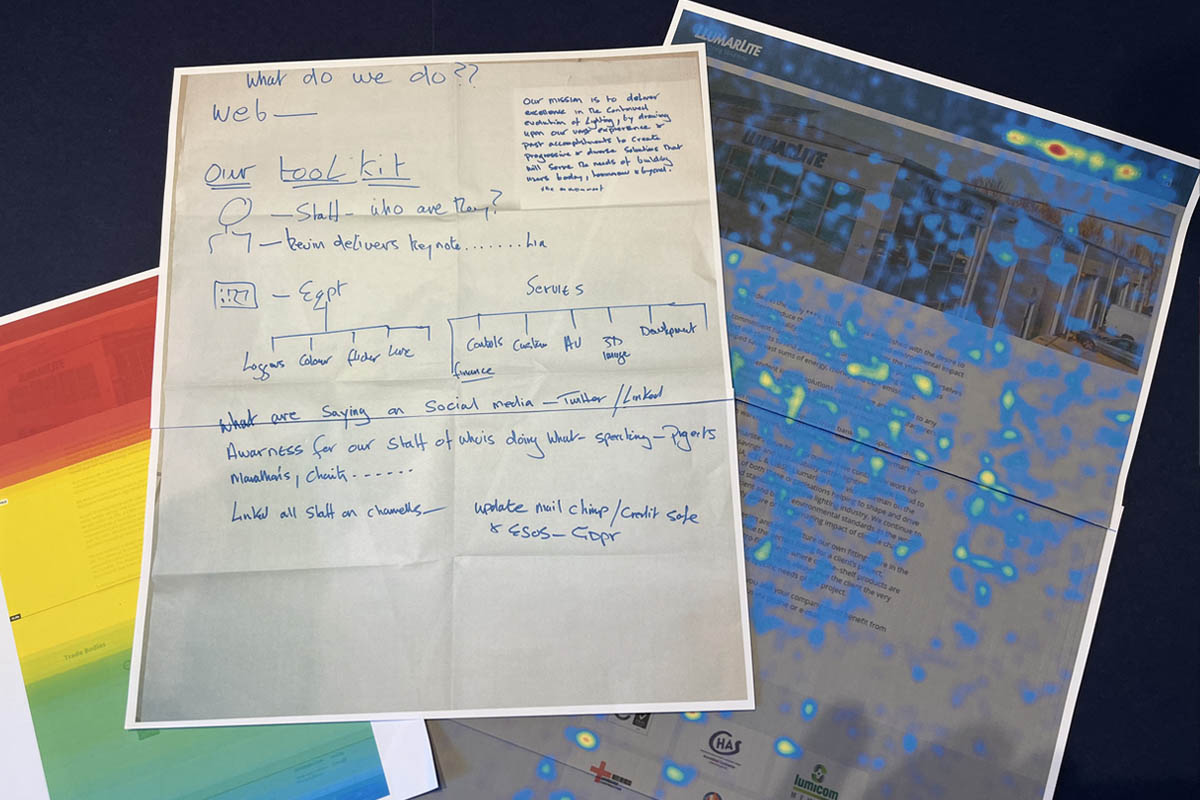
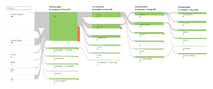
Stakeholder knowledge established the initial working assumptions about audiences, content and organisational needs. Behavioural evidence challenged, refined and prioritised them, allowing us to translate the strongest findings into a shared set of design principles.
People struggled to understand the services.
Mobile usability and readability issues.
Disjointed content and page structures.
Decisions were largely opinion-led.
Updates were slow and costly.
Explain core services clearly without requiring deep navigation.
Prioritise clarity and accessibility across screen sizes.
Use modular content and reusable patterns.
Use behavioural evidence to guide and test decisions.
Choose technology that makes the platform easier to manage, adapt and improve.
Faster understanding and clearer routes to relevant information.
A more consistent and readable experience across devices.
A flexible system that could scale without redesigning every page.
Shared prioritisation and ongoing improvement.
Faster content updates and lower ongoing development effort.
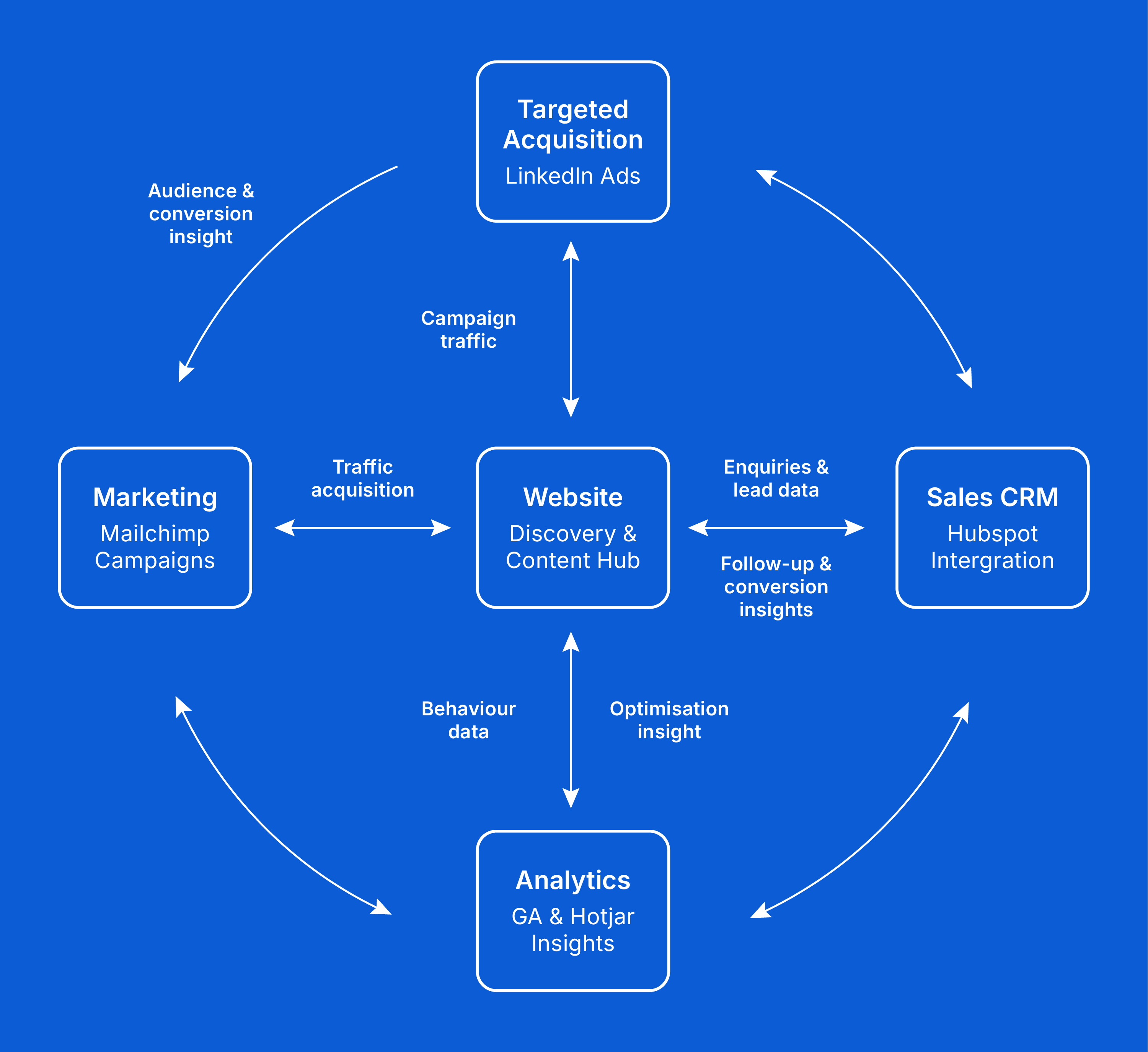
Discovery showed that the website should play a wider role. I repositioned it as the central hub within a broader digital workflow. It would bring services, project work and technical information together, direct audiences towards relevant content, use analytics to understand behaviour, and connect enquiries with more structured follow-up. This created a clearer relationship between campaigns, website activity, enquiries and subsequent customer engagement.
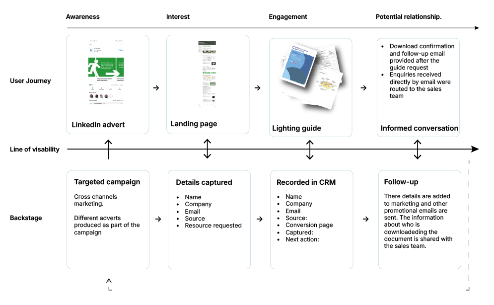
An emergency llighting guide showed how the wider workflow operated in practice. LinkedIn activity directed professionals to a dedicated landing page, where details and subject interest were captured before the guide was delivered. That interest could then be recorded in the CRM, giving sales and technical colleagues more context for relevant follow-up.
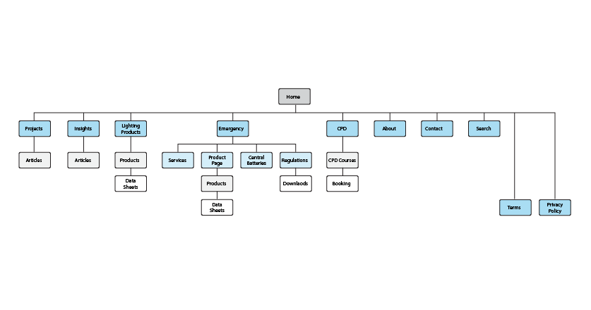
The existing site treated all users in the same way, exposing them to a large amount of information without providing a clear hierarchy or route through it. I reorganised the information architecture around different audience needs, creating clearer routes into Llumarlite’s core services while providing greater technical and regulatory depth where it was relevant.Making the services, products, projects, technical content and CPD activity visible across the site gave stakeholders a shared structure for deciding what belonged where, how people could move through the platform, and where it could be developed further.
I translated the architecture into low- and mid-fidelity wireframes and prototypes to explore how information should be introduced, prioritised and revealed across different content types and screen sizes.
Product pages brought decision-critical information forward while preserving access to detailed specifications. Longer pages, including the homepage, established the company’s position and credibility earlier, then revealed supporting detail progressively. The prototypes gave stakeholders something tangible to explore and a clearer basis for discussing priorities before development decisions became costly to change.
Page structures and CMS logic were developed together. I began with what users needed to understand and how that information should be prioritised, then shaped the CMS around the content those layouts required. In turn, content relationships, platform constraints and the need for future updates fed back into the page structures.
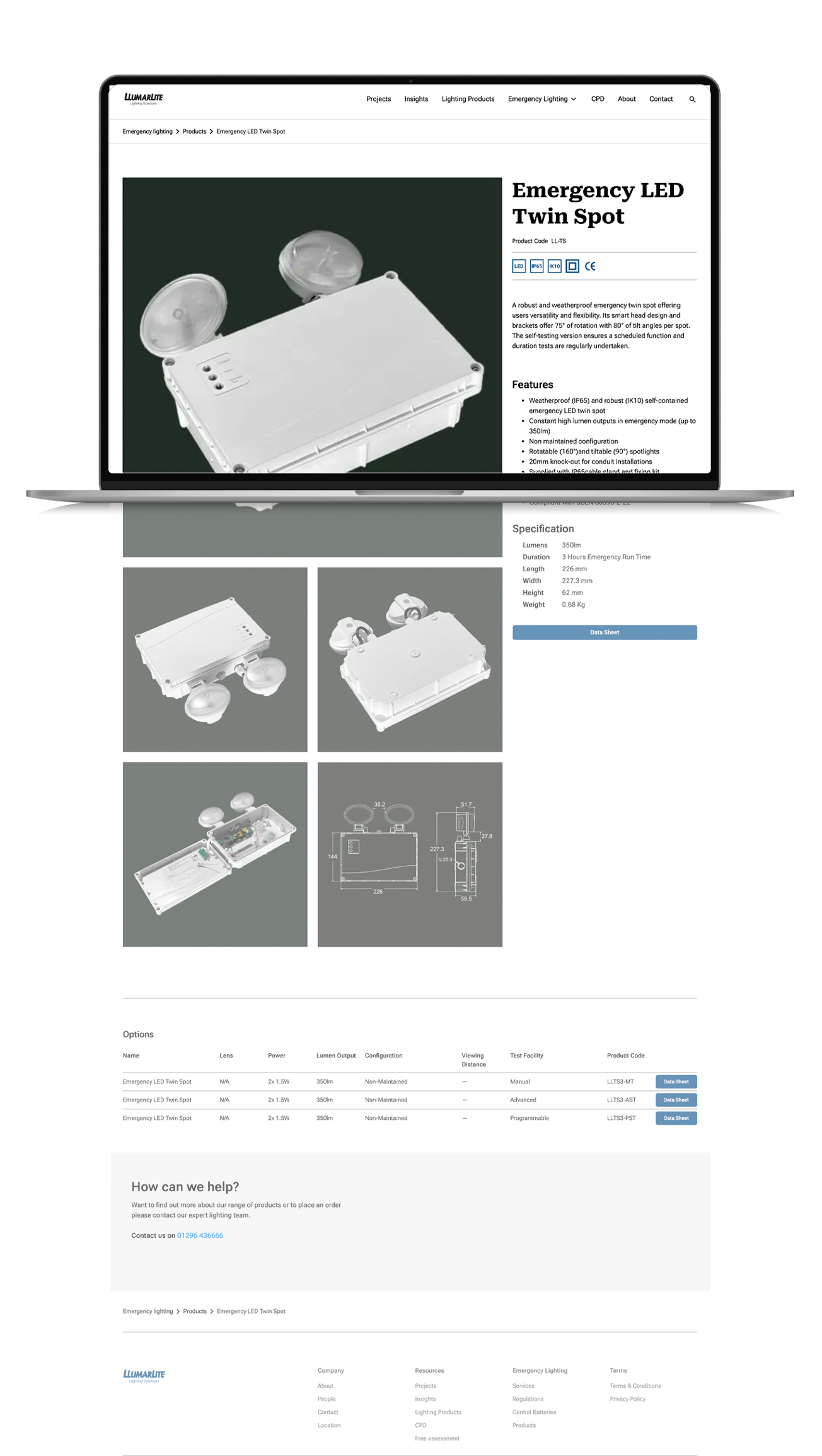
For product pages, core information and imagery were separated from product variants and technical data sheets. This allowed frequently changing technical documentation to be maintained independently, while conditional page logic displayed relevant specifications, downloads and options only where the corresponding content existed.
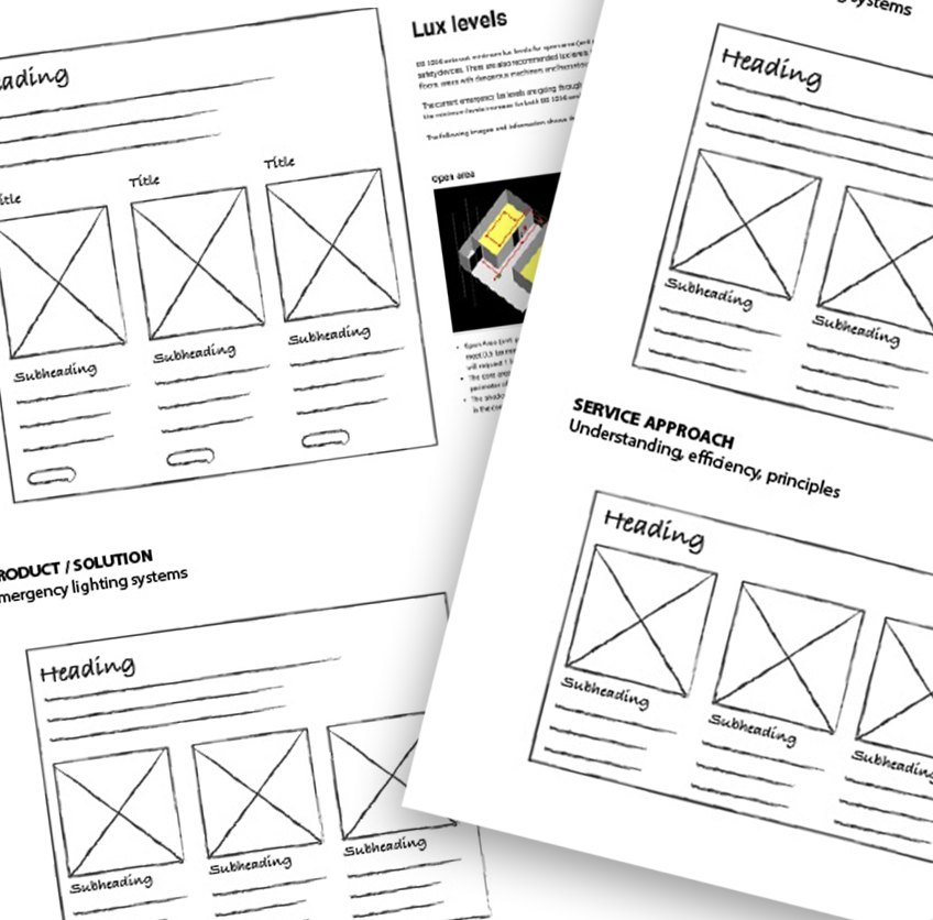
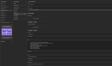
Developing the page structure wireframes across desktop and mobile for the product page
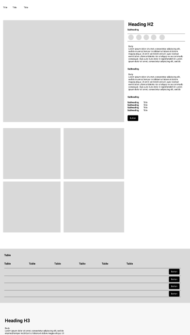
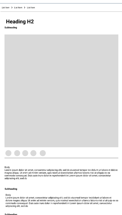
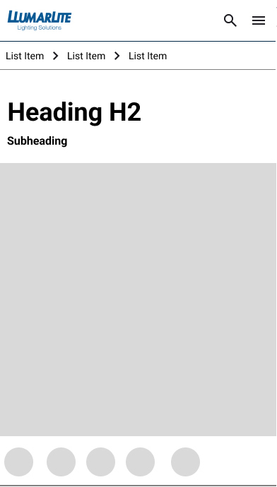
Core product information
Stable information such as product identity, description and imagery.
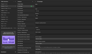
Variants and specifications
Configuration-specific technical information managed separately.
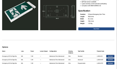
Technical resources / conditional content
Related data sheets and optional content could be surfaced where applicable.
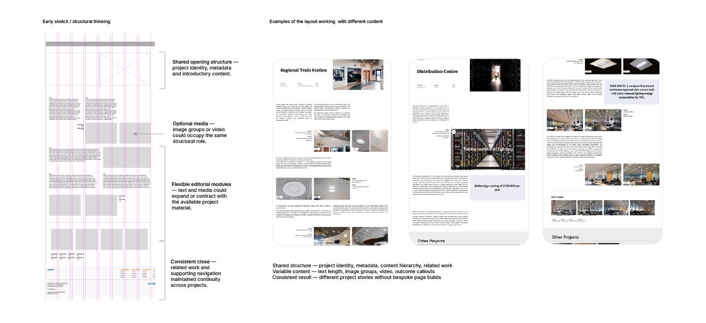
Prototyping provided a quick way to develop and test different components and layouts, helping establish where flexibility added value and where unnecessary variation should be reduced.
Reusable CMS templates, modular sections and shared design rules allowed content to expand or contract while maintaining a coherent hierarchy across desktop, tablet and mobile.
Adaptable components, some with optional fields, enabled shared patterns to support products, services and case studies. Internal teams could create and update content more consistently without redesigning individual pages or repeatedly relying on external development.
The website became an adaptable, connected platform that supported different audiences, was easier to manage internally, and provided a solid foundation for evidence-led improvement.
Launching the platform did not end the project. The measurement tools introduced during the redesign became part of how the website was managed, allowing live behaviour and technical performance to inform further changes.
Evidence led to practical refinements across the platform:
Content hierarchy:
Scroll and click behaviour showed that important positioning and credibility content sometimes appeared too late, so key information was moved earlier in page journeys.
Messaging and calls to action:
Selected wording, hierarchy and interaction points were refined in response to observed behaviour and A/B testing.
Technical performance:
Lighthouse audits informed improvements to speed, accessibility and search performance.
Shared prioritisation:
Stakeholders used the same evidence to agree which issues required attention and assess proposed changes.
This established a continuing cycle of observation, interpretation and improvement, allowing the platform to evolve without returning to periodic, assumption-led redesign.
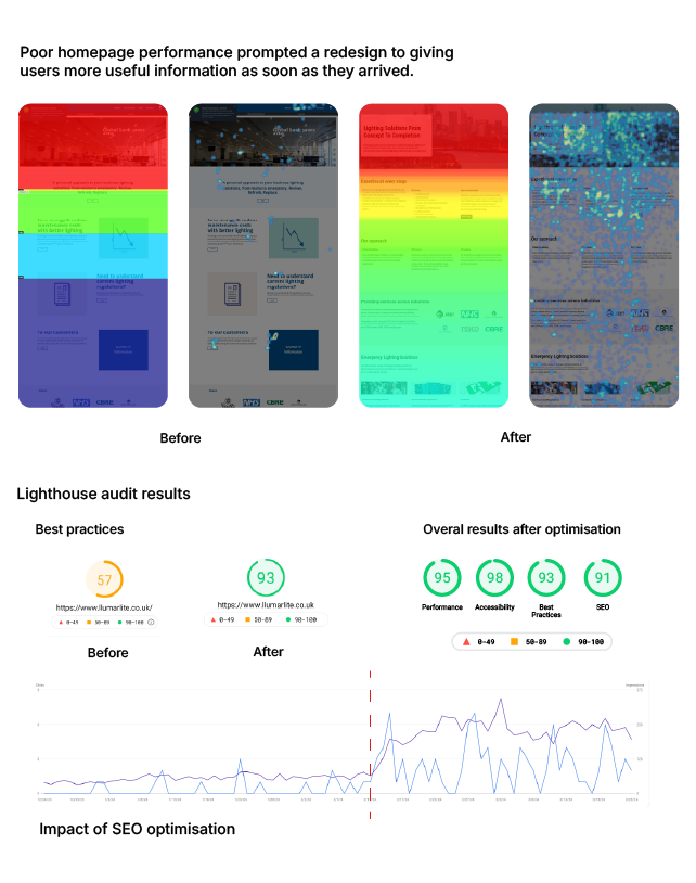
The redesign broadened the role of the website. Rather than serving only as a place to explain Llumarlite’s offer, it became a practical resource where professionals could access technical guides, register for training, explore products and move towards relevant next steps.
This gave the platform continuing value across different stages of the customer relationship, rather than limiting it to a one-off introduction. Following changes to content hierarchy and journeys, average engagement time increased by approximately 20–35% across selected key pages, while website enquiries began leading to substantive sales and project discussions.
Its impact extended internally: connecting campaigns, website behaviour, enquiries and CRM activity gave teams a more coherent view of digital customer engagement, while reusable components and flexible CMS templates made content easier to create, manage and improve without repeated external development.
Greater practical value
The platform supported technical downloads, event registration and product exploration alongside service discovery.
Stronger engagement
71% more users and 39% more views in the first six months of 2022 than across the whole of 2021.
New project opportunities
Website enquiries developed into meaningful sales and project discussions.
Connected workflows
Campaigns, website behaviour, enquiries and follow-up became more visible across teams.
More sustainable delivery
Reusable structures reduced development effort and external dependency.
Continued improvement
Live evidence provided a basis for refining content and journeys after launch.
What began as a website replacement became a wider change in how digital operated within Llumarlite. The most important outcome was not a single interface or performance measure, but the shift from a static brochure to an adaptable platform connected to communication, customer engagement and organisational learning.
Designing for ongoing use rather than a finished launch meant that content, journeys and technical performance could continue to evolve as evidence, audiences and organisational priorities changed.